01
Context
Most men going through a hard season won’t look for a support group. Ask them to climb a mountain with other men, though, and they’ll show up.
Camaraderie connects men who are working through the same life challenge with each other, and with men who have already been through it. The founders came with a metaphor and a conviction: men show up for a shared goal far more readily than for a conversation about feelings.
I worked on it through Layline Design Co. as the product designer, from the first line of the landing page to the logged-in product: the web brand direction, the onboarding funnel and the community platform itself.
02
The problem
Building a forum was never the hard part. The hard part was getting a man to say “I’m struggling” in a place where saying it didn’t make him feel weak.
Many of the hardest climbs men face today are in their own lives, and they face them alone. The usual answers either ask for a vulnerability most men aren’t ready to offer, like therapy-style apps, or give them nowhere useful to put it, like anonymous forums.
The first version had the right instinct but too much on screen: dense paragraphs, a navigation that tried to show every climb at once, and an “orientation” that explained the platform instead of letting men use it. User testing was blunt about that last one. People wanted to see the effect of what they entered straight away.
03
Approach
Three things, agreed with the founders before anything was redesigned.
01
Make asking feel like climbing
One metaphor, carried all the way down. Areas of life are Mountains, goals are Climbs, home is Base Camp, a question is a Mountain Talk. Vulnerability reads as ambition.
02
Let experience be the credential
Every climb asks one question: are you in this now, or have you been here? A man who has been there isn’t a member asking for help. He’s a Sherpa offering it.
03
Measure growth in behaviour, not streaks
Points mark four moments on each climb, from Becoming aware to Living it naturally. No leaderboard, and no daily streak to break.
04
Landing page
The landing page had to read like a series of thoughts, not a sales pitch.
The founders’ brief was a story, not a layout: men have always achieved great things together, what connects them is the goal they’re climbing toward, and today too many men climb alone. Their feedback set the rhythm: no line longer than two, and space between every thought.
I kept it all on one page. Splitting the story from How it works would have added a click, and every change of screen is a chance to drop off. The five steps became a bento of small product moments, each one a real piece of the UI the visitor is about to use.
05
Onboarding
The emotional goal came straight out of testing: “I’m not a loser. I’m experienced. I have something to offer.”
I replaced the orientation with a single, game-like profile builder. A man picks a mountain, sees its climbs, and drags each one into the climbs he has already taken or the ones still ahead. His profile fills in as he goes, and nothing blocks him: Skip is always there.
The founders asked to see the profile completely filled out, not just in progress, because that finished profile is what tells a man he has a past worth sharing. That request shaped the design more than any flow diagram did.
06
Community
Once inside, everything is organised around one question: who has already been where you are?
Base Camp is home. Each mountain has its own Mountain Talk, where men post the question they can’t ask anyone at home, and threads read like conversations between brothers rather than comments under a post.
On every climb, a man says where he stands. “I’m in this now” asks what’s going on and how urgent it is. “I’ve been here” opens the Sherpa flow: what was happening then, what he tried, what he learned, and how he’s willing to help, from sharing his story on the Wall of Wisdom to 1:1 chats or a small team.
07
Altitude
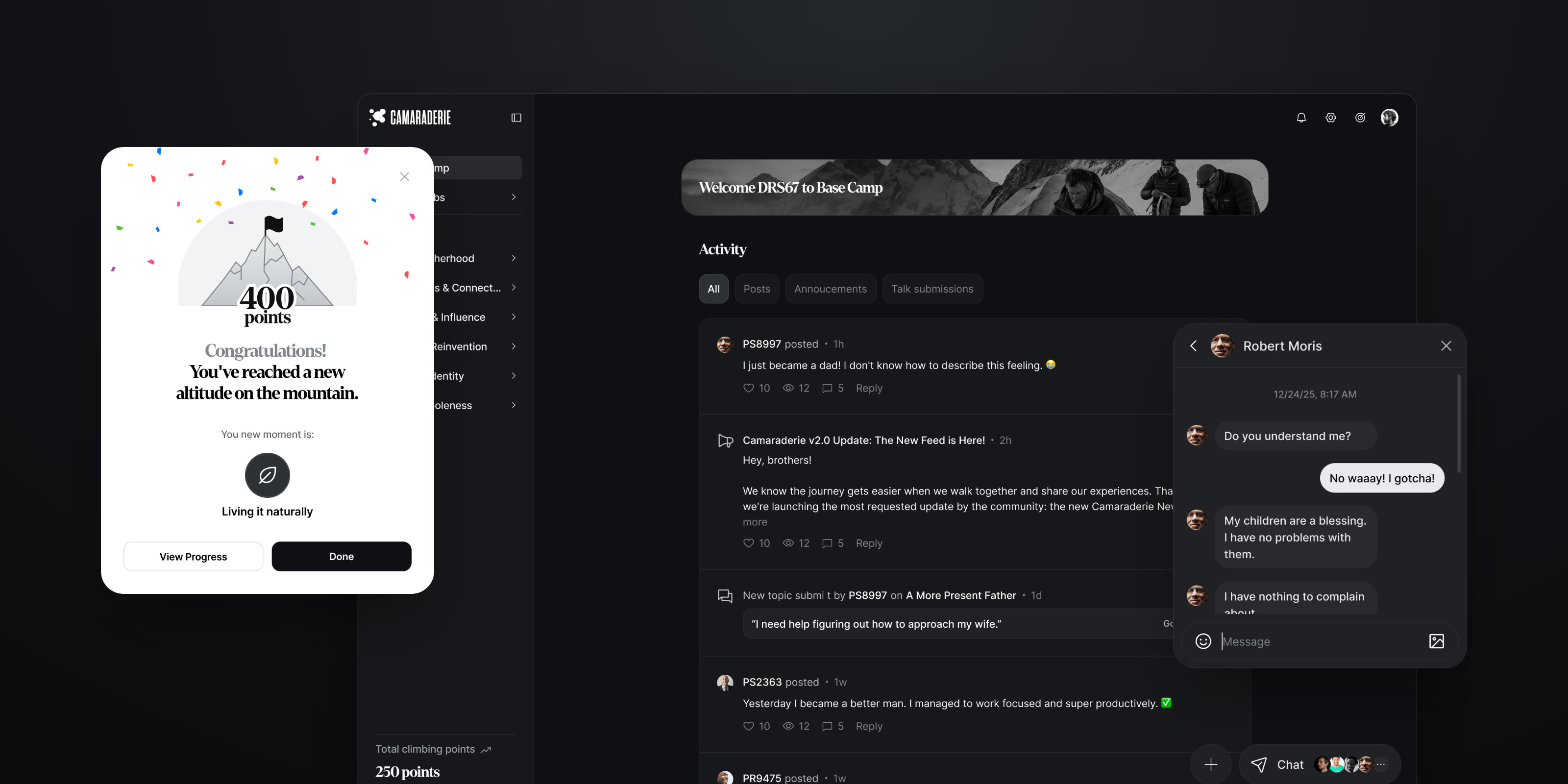
Progress is measured in altitude, and every hundred points has a name.
Points come from showing up for other men: joining a team, reading a resource, connecting with someone on the same climb. Every hundred points is a new altitude and a new moment on the way up, from Becoming aware to Practicing intentionally, Acting consistently and Living it naturally.
I kept the celebration sincere. A new altitude gets a planted flag and a little confetti, then gets out of the way.
08
Outcome
One continuous experience, from the first line of the landing page to the first reply on a climb.
The founders’ throughline was simple. Land on a page that tells a story, sign up, build a profile in a satisfying way, and arrive at Base Camp knowing who you are and where you’re going. The redesign delivers that as one experience, in one visual language.
[Product numbers once you have them: sign-up completion, profiles completed, men who raised their hand as Sherpas.]
09
What I learned
A metaphor works like a design system for language. Once Mountains, Climbs and Sherpas were agreed, hundreds of small naming decisions made themselves, and the ones that didn’t fit were usually features that didn’t belong.
Test the words before the screens. The founders questioned past, present and future climbs before they questioned a single layout. In a product like this, vocabulary is where trust is won or lost, so next time I’d put the terms in front of users first.